Why do TV dramas struggle with middle class characters?

A tale of two BBC TV dramas. My wife suggested that we watch two new series: The Responder and Rules of the Game, which had been well-reviewed. These dramas provide a telling contrast in the portrayal of character.

The Responder centres on a police officer in Liverpool, long past his sell-by date, and I have seen two episodes. The characters are dealt with sympathetically (mainly) and convincingly. This is gritty drama about manly working class people, and it is done well. Of course, it is not about typical working class life, but yet again deals with people working in the criminal justice, interfacing with the criminal underworld, and on the edge of violence. Well-trodden ground it may be, but it presents a sympathetic portrayal of a flawed character dealing with an unholy mess of life, and is one of many such dramas, made here in Britain and elsewhere too. We can all draw something from them.

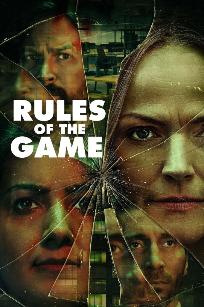
Rules of the Game is a different matter. I have seen the first episode, and that will be enough for me. It deals with an unfolding drama at a family-owned manufacturing business in some unspecified town north of London. The main characters are middle class and I quickly lost interest in all of them. They are cardboard cut-outs living lives of unrelenting falseness, devoid of loving, sympathetic relationships. This might be taken as satire, or a critique of middle class ways, or of capitalism perhaps. But it is actually trying to deal with a serious societal issue – abuse at the workplace – that really does merit serious treatment. But we were not going to be left with any penetrating insights on how these situations develop amongst real people.

On reflection this seems to be pretty typical of modern TV dramas. Most of them are just contrived nonsense stories as a pretext for showing violence on our screens in a variety of settings. Their favoured characters are flawed but honest working class (or perhaps more correctly, lower middle class) investigators trying to unravel a mystery in the face of unrelenting falseness from more senior management and officialdom. More serious dramas have many elements in common, but manage to be less contrived, offering glimpses into grittier parts of society. But even here middle class characters (or, perhaps, upper middle class ones – though all levels of social workers get the treatment too) are shown as unrelentingly false and devious, motivated by purely by money or status, or perhaps just unable to see beyond the rulebook. Of course falseness, money, status and compliance culture are genuine parts of the middle class world – but it is inhabited by real people, whose lives are much more complicated than typically shown. If drama can examine the dilemmas and flaws of a bent copper sympathetically, why can’t they do the same for the managing director of a business, or a chief constable, or even a social worker?

Perhaps the key to this is that these dramas (certainly the ones I watch) are made by middle class people for middle class people. Breaking through the middle class veneer gets us too close to home. Much easier if what we see on the box are caricatures and clearly not people like us, especially if it fits our prejudices about officialdom or people slightly higher up the chain of seniority.

We watch drama because it is not real life. We like to see a bit of violence; we love mysteries and whodunnits – which are mainly absent from our lives. But writers could try a lot harder with their middle class characters – especially when they have made such efforts with others.
A quick makeover for Thinking Liberal

At this year’s Lib Dem conference I was very heartened by the attention my blog is now getting. It was amongst the five nominees for the Lib Dem Voice Blog of the Year – although I came a long way behind the winner, Jonathan Calder’s very different, and long running Liberal England. It then made its way ) into Teads top one hundred blogs, coming in at 73, the tenth highest Lib Dem entry (and beating Liberal England as it happens).

I also got some constructive feedback – first was that the blog did not work well when viewed on a smart phone. I was also getting a bit tired of its visual appearance, with the rather dull blues of the westward view of the rocks from the Isles of Scilly. The beauty of WordPress is that doing a remake is very quick and easy. So I have adopted their latest standard template, which is more mobile friendly. I have changed the title picture to something brighter and airier  – sand sculptures in Copenhagen – supply your own narrative as to why that should be appropriate for a liberal blog. On a big screen there is also a background picture, which is only partially visible. I have picked the Berlin memorial to the Roma.

There are aspects of this format I don’t like so much. The nice serif text font (Georgia I think) is replaced by a Helvetica-style one, and the headlines are capitalised. The lines are shorter. I feel that I am being pushed into a breezier, shorter style. That’s how many blogs work – little and often. But my blog goes a bit deeper, and articles usually come in at about 1,000 words. The old font worked better for this.

Another piece of feedback was that people found it hard to get email alerts for new postings. As I post less often than many, an email alert is good way of staying in touch. I have found a plugin, and you should see a subscription form on the top of the left hand side bar. Do subscribe – though I don’t promise it will work quite as I would like it straightaway. It should automatically alert you to new postings.

There some more things to do. Most bloggers incorporate a small picture for each article. This certainly looks much better when posting to Facebook. I need to do more of this, though finding appropriate pictures adds to the time taken. I’m not sure how the experienced bloggers do this.

There are other things. My tags are a bit of a mess, and need a bit of a rethink.

Any feedback is welcome though.

As aqua fades, should the Lib Dems drop Helvetica?

Helvetica example

Today British political commentators are absorbed by the 2013 Budget. I don’t believe in the value instant comment, and my commentary on the 2012 Budget proved way off the mark anyway. So I will talk about graphic design instead.

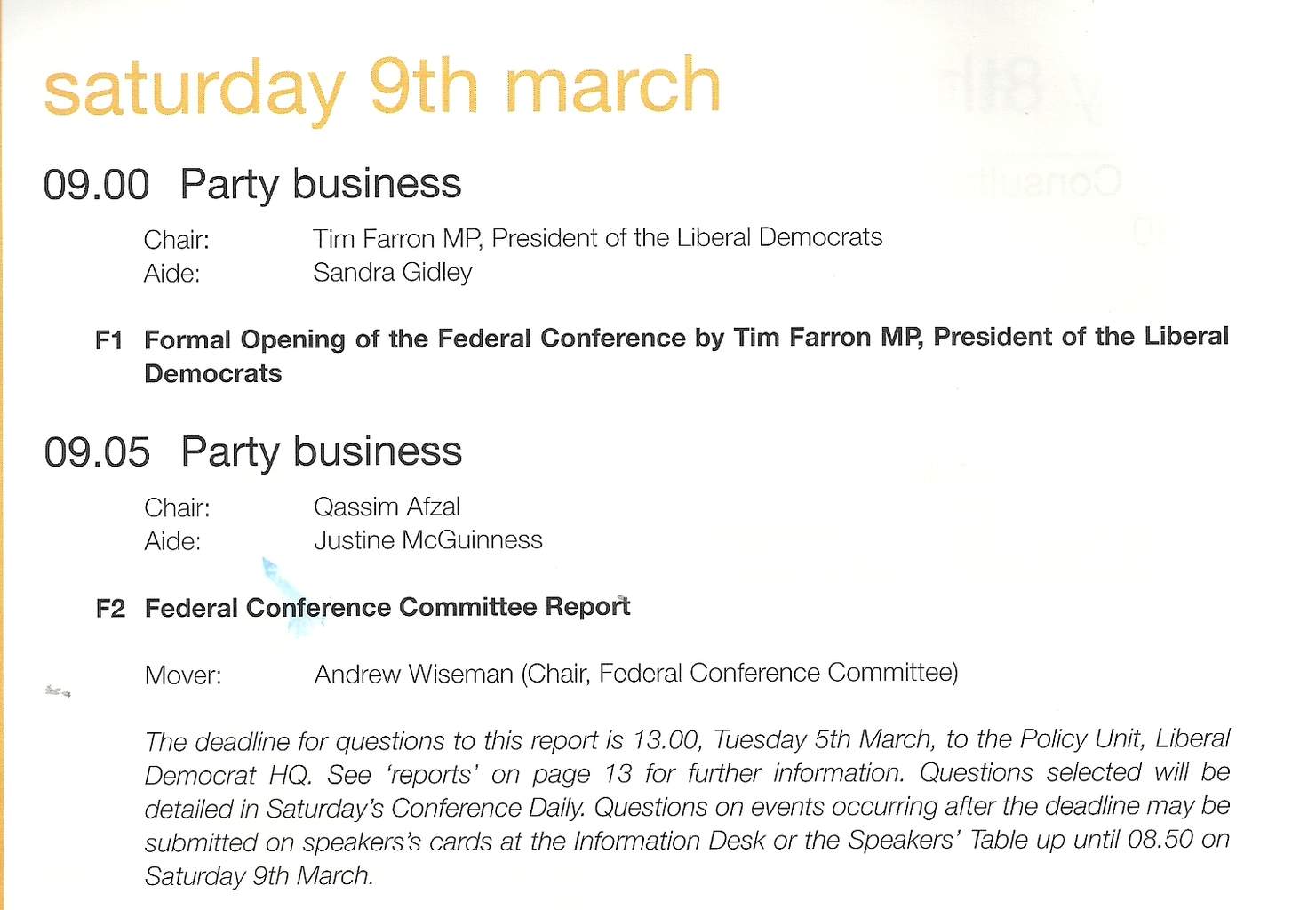
In the run up to the 2010 the Liberal Democrats launched a new house style, featuring a new colour palette and a new font, Helvetica Neue, in three weights (light, medium and heavy) and with an “italic” (which sloped rather than really italic). This was all part of the party’s new, professional image. Getting a political party’s activists to stick to a house style is a pretty hopeless task, but this time the party did quite well. The central campaigns department stuck to the new principles, and centrally produced literature still does. The picture comes from the conference agenda for this March in Brighton.

The most conspicuous part of the new house style was extensive use of the colour aqua, a hue on the blue side of turquoise. At times this even seemed to replace the traditional gold (an orangey yellow) as the party’s main colour. This was certainly new, but not very popular with the activists: too similar to Tory blue. Conference sets have now returned to almost exclusive gold, with aqua relegated to contrast work, alongside a dark red.

What about the font? Political fonts are meant to be boring, and Helvetica certainly fulfils that objective. You see it about a lot (I’m looking at a set of Marks & Spencer vouchers printed in that font as I write this). Graphic design types don’t like it, but I think it works well enough if there isn’t too much text: on posters and title pages and so on. Having three weights makes it a bit more flexible than the very similar, and free, Arial which just comes in normal and bold – though I really don’t like the Helvetica heavy. In text blocks, though, it is much less happy. It reminds me of marketing brochures which are meant to be seen rather than read, and where anything interesting in the text has been edited away long ago as a hostage to fortune. Unlike marketing guff, political text should have content and it should be read.

There is another problem, which will bother only a few. It’s a cheap font without lower case numbers (or “old-style” numbers, contrasting with upper case or “titling” figures). This is a bit of problem because the style guide recommends avoiding the upper case where possible. You can see this in the date “saturday 9th march” in the picture. The number 9 sticks out horribly – compare it with the one in the text of this blog (where lower case numbers, unusually, are standard). Unfortunately being cheap is no doubt one of critical features for any Lib Dem standard font. Probably easier to drop the advice about avoiding upper case letters: the text above would look much better if day and month had the normal initial capitals.

An alternative to dropping Helvetica is adopting a text font to work alongside it, perhaps a serif one. There are many cheap ones available, though  the commonest, Times New Roman, is probably too over-exposed.

Will the Lib Dems adopt a new house style for the 2015 campaign, to reflect the fact that the political context has completely changed? A new image for an older and wiser party – and distancing itself from the rash pledges of 2010? Or will it want to emphasise continuity – like the keeping of the pledge on personal allowances. I would prefer the former. After all the centrally directed campaigns in 2010 did not work that well in the end: the party lost seats, especially where fresh candidates tried to get away with contentless campaigns with lots of house style. I’m not holding my breath though.


bollocks and the bauhaus

Last weekend we went to see the Barbican’s wonderful exhibition on the Bauhaus.  The Bauhaus was a school of artists, craftsmen and designers who operated between 1919 and 1933 in Germany, and were among the Weimar republic’s few outstanding positive legacies.  They led modernist design, and are famous for all sorts of achievements, from furniture to architecture.  As Hitler took over, they dispersed across the world, but especially to America, where their influence was profound.

1925 Catalogue cover

There were many wonderful things on show at the Barbican, but what blew me away was the Bauhaus typography and graphic design.  On a very amateur basis I have struggled with graphic design, for example for political leaflets; I know enough to know how difficult it is.  My impression of pre-modern design is that it was at best stodgy and at worst plain awful.  And yet here, pretty much fully formed in the mid 1920s came a series of designs that stand the test of time.  Classics, both elegant and highly functional.  A product catalogue was particularly impressive (a low resolution picture of the cover is reproduced here – though I was more impressed with the inside pages).  San serif fonts, block and grid organisation, sparing but effective use of colour (dictated by the limits of printing technology no doubt), double justified text, use of white space, decapitalisation, perpendicular text.  A whole series of techniques we now take for granted coming together, pretty much perfectly formed.  The designs may look a bit dated today, but they still work – so much so that there is an overwhelming temptation to copy them.  I wanted to find out more.

1925 curriculum cover

They key figure in this achievement was Herbert Bayer, but he was taking on ideas developed by the wider school and he forged them in the process of play and challenge that was the Bauhaus process.  Bayer went on to a distinguished career in America as a designer, founding his own press.

The first jarring note at the exhibition came at the shop.  A number of Bauhaus designs were offered for sale.  At massive prices.  Particularly striking was a chess set, a design of breathtaking elegance and simplicity, on offer for about £400 (not including board, another £300 or so).  One of their classic chairs, and a simple stool, were also on offer for similarly staggering sums.  Now the key point about Bauhaus designs was their simplicity and ease of manufacture.  It follows that these items did not cost very much to produce (and the furniture was produced in large quantities for their own use).  And the Bauhaus had a socialistic outlook, wanting their work to be accessible.  What the public are being asked to pay for is simply intellectual property, so that these items can be, almost literally, icons for the elite.  The Bauhaus has been appropriated in the modern world to represent exclusivity.

The next jarring experience came when I bought a book (itself inexpensive) on the bauhaus and design theory edited and largely written by a couple of American design academics, Ellen Upton and J Abbot Miller.  The jarring note here was its mediocrity, contrasting with the inspiring excellence of the Bauhaus project.  The authors look pygmies by comparison.  I’m not asking for my money back.  The book had some interesting history and ideas, and some useful pictures.  But I wasn’t left with much of an idea of what the theory behind Bauhaus graphic design was, or of its successes and failures.  Instead I got a lot of half-digested ideas about “alphabets” and “language”.  The layout and design of the book itself was incoherent and uninspiring.  It took on some of the Bauhaus design features, but not others (the main font was serif, and the text left-justified).  There were a number of playful ideas which fell flat, as did their language (quite a few nouns, like privilege and foreground, appropriated as verbs).  There was a digression into psychoanalysis, by which they seemed to mean pop-Freud (nobody else gets a mention), whose chief mission was to show us how some ideas about masculinity and femininity have not stood the test of time.  There is an afterthought on fractral geometry (as an antithesis to Bauhaus) which did not leave me much wiser as to how this might help graphic design.

The biggest problem, though, was that for some reason the editors decided to give a central role to the Bauhaus instructor Wassilly Kandinsky’s attribution of primary colours to basic geometric shapes (shown at the start of the piece).  This is not a particularly successful idea, though no doubt played a useful role on the development of Bauhaus thought.  The yellow triangle was set in opposition to the blue circle, with the red square being intermediate.  Yellow and the triangle were associated with movement and light; blue with stability and darkness.  The big problem with this is that it isn’t clear that blue should be the opposition to yellow.  In the standard colour circle the opposition to yellow is purple, the darkest of the colours.  It isn’t obvious that blue is darker than red.  Bayer did use the basic shapes in his work, but I could see no sign that Kandinsky’s colour ideas played any role.  The predominant colour in his work on display, indeed, was orange.  So why make such a meal of it?

So Bauhaus has become the focus of the idle musings of the mediocre, who hope that just by talking about the excellent that some of the excellence can rub off onto them.  I suppose such a fate awaits the excellent in any field.  Meanwhile I stay inspired, and I have bought a couple more books on graphic design to develop my understanding further.

Fontcrime: Comic Sans lives on

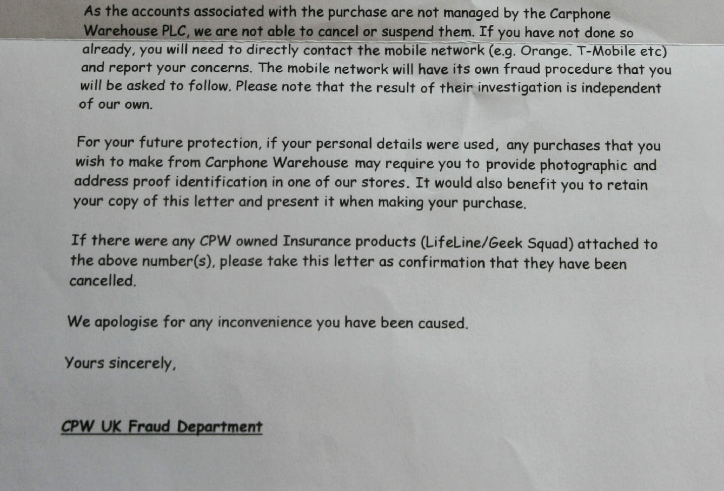
Readers who had seen my post on Public services are different may remember that somebody had been fraudulently buying up phone contracts under my name.  Last Friday I received this letter from the Carphone Warhouse UK Fraud Department.  Apart from the clumsy, evasive wording of the letter, what really hit me was its font.  Comic Sans should have died of ridicule years ago.  There’s even a website called bancomicsans.com.

Actually, Comic Sans has its place.  Its rather childlike appearance makes it quite appropriate for use in primary schools or nurseries, for example.  But what on earth is a fraud department of a major company doing using it?

If nothing else this shows that this department is disconnected from the rest of the company, which no doubt has strict house style rules. This is not a bad thing of itself.  The evasive and non-empathetic wording also shows that no communications professional has been anywhere near it.

As for the outcome, this letter says to me that my case has been filed in the closed category, with a bar being placed on anybody quoting my name an address buying anything from Carphone Warehouse.  I’m not complaining; I have no plans to buy anything from Carphone Warehouse after a couple of rather bad experience with them a few years ago, including another fraud.

But I’m still amazed how so many people are fontblind.