Last weekend we went to see the Barbican’s wonderful exhibition on the Bauhaus. The Bauhaus was a school of artists, craftsmen and designers who operated between 1919 and 1933 in Germany, and were among the Weimar republic’s few outstanding positive legacies. They led modernist design, and are famous for all sorts of achievements, from furniture to architecture. As Hitler took over, they dispersed across the world, but especially to America, where their influence was profound.

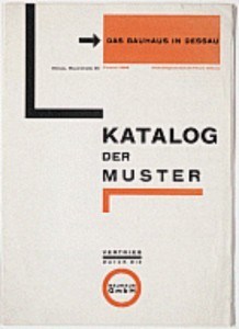
There were many wonderful things on show at the Barbican, but what blew me away was the Bauhaus typography and graphic design. On a very amateur basis I have struggled with graphic design, for example for political leaflets; I know enough to know how difficult it is. My impression of pre-modern design is that it was at best stodgy and at worst plain awful. And yet here, pretty much fully formed in the mid 1920s came a series of designs that stand the test of time. Classics, both elegant and highly functional. A product catalogue was particularly impressive (a low resolution picture of the cover is reproduced here – though I was more impressed with the inside pages). San serif fonts, block and grid organisation, sparing but effective use of colour (dictated by the limits of printing technology no doubt), double justified text, use of white space, decapitalisation, perpendicular text. A whole series of techniques we now take for granted coming together, pretty much perfectly formed. The designs may look a bit dated today, but they still work – so much so that there is an overwhelming temptation to copy them. I wanted to find out more.

They key figure in this achievement was Herbert Bayer, but he was taking on ideas developed by the wider school and he forged them in the process of play and challenge that was the Bauhaus process. Bayer went on to a distinguished career in America as a designer, founding his own press.
The first jarring note at the exhibition came at the shop. A number of Bauhaus designs were offered for sale. At massive prices. Particularly striking was a chess set, a design of breathtaking elegance and simplicity, on offer for about £400 (not including board, another £300 or so). One of their classic chairs, and a simple stool, were also on offer for similarly staggering sums. Now the key point about Bauhaus designs was their simplicity and ease of manufacture. It follows that these items did not cost very much to produce (and the furniture was produced in large quantities for their own use). And the Bauhaus had a socialistic outlook, wanting their work to be accessible. What the public are being asked to pay for is simply intellectual property, so that these items can be, almost literally, icons for the elite. The Bauhaus has been appropriated in the modern world to represent exclusivity.
The next jarring experience came when I bought a book (itself inexpensive) on the bauhaus and design theory edited and largely written by a couple of American design academics, Ellen Upton and J Abbot Miller. The jarring note here was its mediocrity, contrasting with the inspiring excellence of the Bauhaus project. The authors look pygmies by comparison. I’m not asking for my money back. The book had some interesting history and ideas, and some useful pictures. But I wasn’t left with much of an idea of what the theory behind Bauhaus graphic design was, or of its successes and failures. Instead I got a lot of half-digested ideas about “alphabets” and “language”. The layout and design of the book itself was incoherent and uninspiring. It took on some of the Bauhaus design features, but not others (the main font was serif, and the text left-justified). There were a number of playful ideas which fell flat, as did their language (quite a few nouns, like privilege and foreground, appropriated as verbs). There was a digression into psychoanalysis, by which they seemed to mean pop-Freud (nobody else gets a mention), whose chief mission was to show us how some ideas about masculinity and femininity have not stood the test of time. There is an afterthought on fractral geometry (as an antithesis to Bauhaus) which did not leave me much wiser as to how this might help graphic design.
The biggest problem, though, was that for some reason the editors decided to give a central role to the Bauhaus instructor Wassilly Kandinsky’s attribution of primary colours to basic geometric shapes (shown at the start of the piece). This is not a particularly successful idea, though no doubt played a useful role on the development of Bauhaus thought. The yellow triangle was set in opposition to the blue circle, with the red square being intermediate. Yellow and the triangle were associated with movement and light; blue with stability and darkness. The big problem with this is that it isn’t clear that blue should be the opposition to yellow. In the standard colour circle the opposition to yellow is purple, the darkest of the colours. It isn’t obvious that blue is darker than red. Bayer did use the basic shapes in his work, but I could see no sign that Kandinsky’s colour ideas played any role. The predominant colour in his work on display, indeed, was orange. So why make such a meal of it?
So Bauhaus has become the focus of the idle musings of the mediocre, who hope that just by talking about the excellent that some of the excellence can rub off onto them. I suppose such a fate awaits the excellent in any field. Meanwhile I stay inspired, and I have bought a couple more books on graphic design to develop my understanding further.
