Today British political commentators are absorbed by the 2013 Budget. I don’t believe in the value instant comment, and my commentary on the 2012 Budget proved way off the mark anyway. So I will talk about graphic design instead.
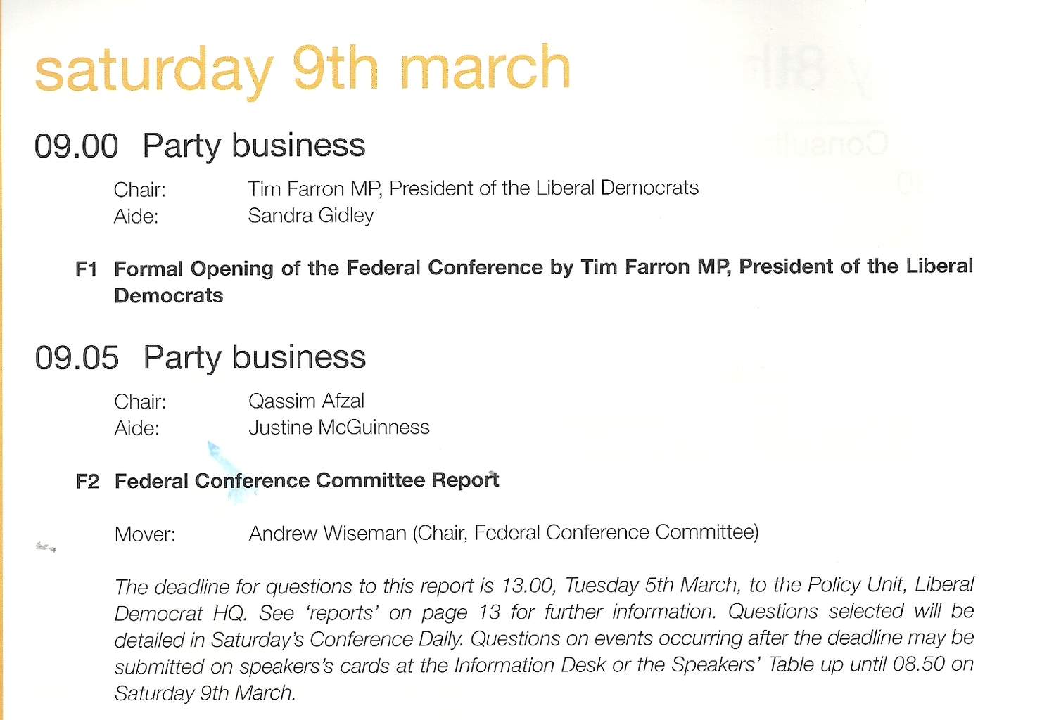
In the run up to the 2010 the Liberal Democrats launched a new house style, featuring a new colour palette and a new font, Helvetica Neue, in three weights (light, medium and heavy) and with an “italic” (which sloped rather than really italic). This was all part of the party’s new, professional image. Getting a political party’s activists to stick to a house style is a pretty hopeless task, but this time the party did quite well. The central campaigns department stuck to the new principles, and centrally produced literature still does. The picture comes from the conference agenda for this March in Brighton.
The most conspicuous part of the new house style was extensive use of the colour aqua, a hue on the blue side of turquoise. At times this even seemed to replace the traditional gold (an orangey yellow) as the party’s main colour. This was certainly new, but not very popular with the activists: too similar to Tory blue. Conference sets have now returned to almost exclusive gold, with aqua relegated to contrast work, alongside a dark red.
What about the font? Political fonts are meant to be boring, and Helvetica certainly fulfils that objective. You see it about a lot (I’m looking at a set of Marks & Spencer vouchers printed in that font as I write this). Graphic design types don’t like it, but I think it works well enough if there isn’t too much text: on posters and title pages and so on. Having three weights makes it a bit more flexible than the very similar, and free, Arial which just comes in normal and bold – though I really don’t like the Helvetica heavy. In text blocks, though, it is much less happy. It reminds me of marketing brochures which are meant to be seen rather than read, and where anything interesting in the text has been edited away long ago as a hostage to fortune. Unlike marketing guff, political text should have content and it should be read.
There is another problem, which will bother only a few. It’s a cheap font without lower case numbers (or “old-style” numbers, contrasting with upper case or “titling” figures). This is a bit of problem because the style guide recommends avoiding the upper case where possible. You can see this in the date “saturday 9th march” in the picture. The number 9 sticks out horribly – compare it with the one in the text of this blog (where lower case numbers, unusually, are standard). Unfortunately being cheap is no doubt one of critical features for any Lib Dem standard font. Probably easier to drop the advice about avoiding upper case letters: the text above would look much better if day and month had the normal initial capitals.
An alternative to dropping Helvetica is adopting a text font to work alongside it, perhaps a serif one. There are many cheap ones available, though the commonest, Times New Roman, is probably too over-exposed.
Will the Lib Dems adopt a new house style for the 2015 campaign, to reflect the fact that the political context has completely changed? A new image for an older and wiser party – and distancing itself from the rash pledges of 2010? Or will it want to emphasise continuity – like the keeping of the pledge on personal allowances. I would prefer the former. After all the centrally directed campaigns in 2010 did not work that well in the end: the party lost seats, especially where fresh candidates tried to get away with contentless campaigns with lots of house style. I’m not holding my breath though.
If cheap is so important why not look at the list of liberation font families, and definately reintroduce capitalisation in dates!